a visual lifestyle (week of 26mar13)
here are the goods this week. make sure to check some of them out – a couple of nifty static pieces are on board.
 (1) bye-bye sxsw 2013 – with the close of the latest SXSW festival, several infographics emerged. one of them – surprisingly, yet aptly text-based – summarizes attendee tweets on their experience with products, panels + places. minimal in tone + design, we are curious as to how the tweets were curated! check out SXSW Wrap Up: Launches, Panels, Buzz & Snark here. likewise, hopping on the social media train, an infographic outlining the most instagrammed venues reared its head. rife with places, people, popularity + even appearances by grumpy cat, the aesthetic keeps things in order. check out Most Instagrammed Venues Of SXSW 2013 here.
(2) twitter-tation – continuing with the social media train of thought, here’s a nifty graphic outlining 11 of the most obnoxious tweeter types such as the hardcore developer, the know-it-all developer, the eventaholic, the humblebragger, the copycat + the noob. not too shabby but perhaps a lil geek-heavy as far as profiling. seems as though they may be missing some personas. your thoughts?
(3) every 60 secs online – this visual by Intel helps us understand the scale of the interwebs by enumerating on the quantity + type of transactions which occur every minute. insights include 20 new victims of identity theft, 204mil emails sent, 47K app downloads, $83K in Amazon sales, 6 new wikipedia articles published, 6mil Facebook views, 2+mil google searches + 1.3mil youtube video views!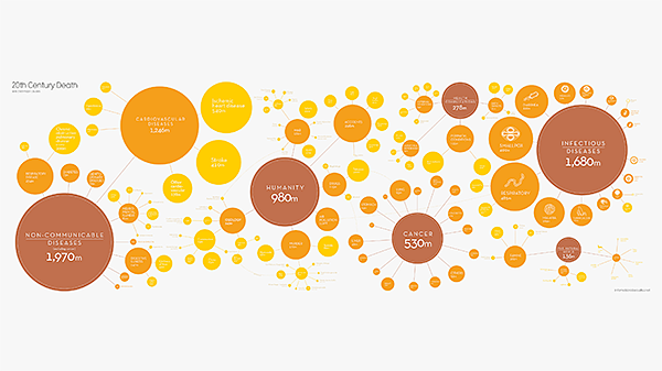
(4) morbidly delicious – the folks over at the Guardian took it upon themselves to gather + analyze mortality data from around the world in an effort to determine the leading causes of death. was it murder? misfortune? maladies? check it out for yourself here How We All Die, Visualized. the largest clusters consist of non-communicable diseases, infectious diseases, humanity + the natural world.
(5) social network congestion – here’s a sharp little interactive data visualization interface by the bitly science team that illustrated a geographic breakdown of numerous social networks (many of which we haven’t a clue about). the breakdown of traffic from social networks by country features a geographic interaction which is accompanied by a set of bar graphs which change according to selected country.
(6) social resume? what’s that? – interested in creating a social resume? well, here’s a good place to start! created by onlinecolleges.com, it provides a quick visual at to the key ingredients which include – you guessed it – a linkedin profile but much, much more! the graphic also serves up key stats in regard to site usage, some do’s + don’ts as well as other related miscellany. Why You Need a Social Resume (and How to Build One) is a rather involved study so check it out!
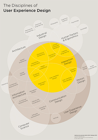 (7) the design universe (redux) – confused by all the variant forms of design that go into digital media projects? how about all of the related skillsets that are emerging or being redefined? Thomas Glaser has attempted to visualize the relationship between the various design disciplines + UX (user experience) in his Infographic: The Intricate Anatomy Of UX Design graphic. Piggybacking off of Dan Saffer’s previous iteration (called The Disciplines of User Experience Design), it serves as an updated attempt to refine the model as tech has evolved. a lofty goal indeed but well done. we commend him on his efforts + this should serve as a valuable tool for communication!
links
- http://readwrite.com/2013/03/15/sxsw-wrap-up-the-launches-panels-buzz-snark-infographic
- http://allfacebook.com/sxsw-2013-instagram_b113142
- http://mashable.com/2013/03/25/tech-industry-obnoxious-tweeters/
- http://readwrite.com/2013/03/20/a-lot-can-happen-in-an-internet-minute
- http://www.guardian.co.uk/news/datablog/2013/mar/18/information-beautiful-how-we-die
- http://bitlyscience.github.com/geo_social/
- http://www.thedailymuse.com/job-search/why-you-need-a-social-resume-and-how-to-build-one/
- http://www.fastcodesign.com/1671735/infographic-the-intricate-anatomy-of-ux-design