The Couch
Donec mattis dapibus eros non adipiscing. Mauris sodales cursus sapien eget consequat. Class aptent taciti sociosqu ad litora torquent per conubia nostra, per inceptos himenaeos.

Donec mattis dapibus eros non adipiscing. Mauris sodales cursus sapien eget consequat. Class aptent taciti sociosqu ad litora torquent per conubia nostra, per inceptos himenaeos.

In euismod quam sit amet arcu tempor nec fermentum neque adipiscing. Fusce sit amet cursus felis. Morbi tristique odio eu tortor iaculis auctor. Donec convallis dui sit amet metus hendrerit.

Lorem ipsum dolor sit amet, consectetur adipiscing elit. Duis fermentum aliquam molestie. Duis suscipit mollis massa, a auctor est mattis ut. Ut luctus congue sodales. Suspendisse ligula orci, placerat sit amet volutpat nec.

Ut sit amet ligula nisl, ut cursus velit. Quisque vulputate semper ante, sit amet egestas dui suscipit in. Morbi velit arcu, iaculis ut molestie ac, sollicitudin aliquam turpis. Nulla interdum.
Pellentesque nibh tortor, hendrerit ac fermentum ut, egestas id turpis. Nam pulvinar metus ac elit lobortis cursus. Quisque ut leo ipsum, in suscipit urna. Etiam feugiat tellus vel ipsum.
Morbi malesuada faucibus ullamcorper. Nullam vel tortor a dolor condimentum hendrerit. Pellentesque vel nunc non leo ullamcorper adipiscing in vel odio.
This week’s findings are interspersed with some interactives in addition to the traditional static visual pieces. Please consume + enjoy.
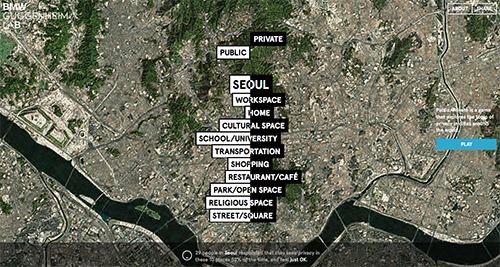 (1) seeking privacy in public – this nifty interactive positions itself as a game in order to gather information from willing participants in order to gather data on which spaces (be they public or private) individuals seek privacy. after a short 60-sec inquiry, you are asked to rate the degree to which you seek privacy in spaces such as home, work, school, the park + so forth. your data points are then compared to others in your immediate (city) area as well as another city which the app selects. despite the beauty + simplicity of the app, it seems to lack teeth or tangibility in its final delivery. summary statements such as “29 people in Seoul responded that they seek privacy in these 10 places 52% of the time, and feel just OK” don’t necessarily mean much when you break it down.
(2) time travel + movies = brain pain – created by a mysterious tumblr user opting for the handle mr. dalliard, this visual is yet another stab at the complexities of time travel as related to relics of pop culture – it’s movies this time round! things look great at first – stylistically coherent, a little retro-scientific homage thrown in to boot, clever approach; however, upon closer scrutiny, i can’t help but think that there might be a better means of illustrating these relations (nothing comes to the fore an of now but it’s a gut feeling). atop that, some of the key categorizations seem off or used rather loosely. take some time + dig in to see for yourselves.
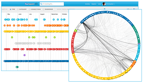 (3) my foursquare year in check-in’s – in commemoration of this years foursquare day (16 april), that great bastion of location-based social media gave its users the gift of his/her own personal infographic outlining the past year’s activity! end users can view according to category, connections, time or randomly. furthermore, one can contract the timeline to see a particular period of activity. overall, a great way to interact with one’s own personal data collection.
(4) teens dropping facebook like a bad habit? – this playful amalgam of colors, fonts + shapes vividly depicts recent reports finding that the teen market is using facebook less or completely abandoning ship + using other ephemeral, more conversationally-suited social media outlets (e.g. kik, whatsapp, snapchat) instead. blending both quantitative + qualitative data, this visual offers more complete insight into this emerging trend.
(5) edgerank…sounds like tricky maths to me – facebook’s edgerank has mystified persons near + far alike…be them in marketing, IT, the c-suite or otherwise. this handy infographic attempts to solve the quandary in a simple, linear, easy-to-read self-contained package. edgerank, the algorithm which facebook uses to determine the items in the news feed that are most relevant to you, consists of 3 primary variables: affinity, weight + time decay. or, in a more digestible format, it consists of your personal interaction + your network reaction (see the chart for details). to bring the message home, a handy batman analogy serves as the icing on the cake. to be honest, this beats reading the equivalent whitepapers pounding about the interwebs.
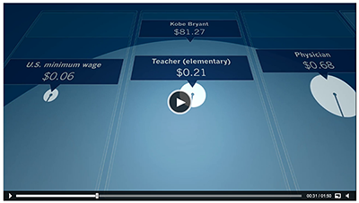 (6) dollar…dollar bills – despite being a video, ‘sixty seconds of salary’ does a great job of utilizing the timeline (sans interactivity) to express the vast discrepancies in levels of income amongst a wide array of individuals. be they the president, a prominent CEO, a basketball pro, a teacher or a minimum wager, it’s quite revealing to see this evolve in such an eloquent visual form. props all round + make sure to check it out here!
links
forgive our visual truancy…things have been amok around here lately but better late than never yes? here are a few visual tidbits to digest.
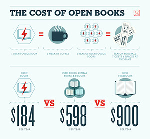
(1) opensource education…it’s free (at least the books are)? – the average student reportedly pays $900 on books alone per year (granted that they actually buy + read them right?). well open textbooks is offering an amiable alternative to students both far + wide. this great visual breaks it down into common sense, approachable terms with which we can all relate. for example, 1 opensource book = 1 week or coffee OR 1 year of opensource books = season football tickets + snacks. furthermore, it contextualizes the overall saving by illustrating how much is saved en mass by classroom (e.g. a 50 student algebra class would save the same amount of cash levied for a vacation to europe). well done…they did us proud!
(2) digital philanthropy + non-profit fundraising – despite good efforts + resources, we feel that this particular infographic pales in comparison to the report + actual data – even to the point of obfuscation + general irrelevancy. despite the agreeable visual treatment, use of typography + color choices, the graphic falls flat in conveying comprehensible data that is much use. we took a glance over the actual report (a hefty 44 pages) which only reaffirmed our initial impressions. truly an example of #visualFAIL.

(3) check yourself…protect yourself – with this visual guide to protecting your online identity, you can feel armed (at least a bit) against the internet minions on the prowl for your digital valuables. short + sweet, it serves as a good preliminary for us all for establishing a solid foundation for identity protection centering on passwords, privacy settings + mobile platforms. you may think “why would anyone want my identity? i’m no big deal.” well, the harvesters of identities don’t care whose info they are able to wrangle so long as it adds to the bottom line. so take heed + give this one a once-over! you’ll be glad you did.
(4) did somebody say revolution? – this interactive infographic created on a web 2.0 toolset (flash would have likely provided a smoother, cleaner UI but thanks to iOS, no dice there) is a formidable project surprisingly funded by kickstarter! beautiful trouble: a toolbox for revolution provides the viewer with an networked overview of factors (tactics, theory), toolsets, practitioners + case studies involved with creative protest wherein which related entities converge/cluster together upon interaction. it also features a nifty search capability that makes finding topics quickly + easily. bravo…way to go!!!
links
here are the goods this week. make sure to check some of them out – a couple of nifty static pieces are on board.
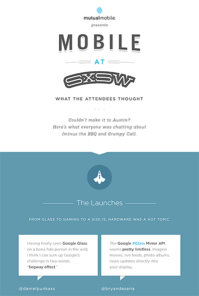 (1) bye-bye sxsw 2013 – with the close of the latest SXSW festival, several infographics emerged. one of them – surprisingly, yet aptly text-based – summarizes attendee tweets on their experience with products, panels + places. minimal in tone + design, we are curious as to how the tweets were curated! check out SXSW Wrap Up: Launches, Panels, Buzz & Snark here. likewise, hopping on the social media train, an infographic outlining the most instagrammed venues reared its head. rife with places, people, popularity + even appearances by grumpy cat, the aesthetic keeps things in order. check out Most Instagrammed Venues Of SXSW 2013 here.
(2) twitter-tation – continuing with the social media train of thought, here’s a nifty graphic outlining 11 of the most obnoxious tweeter types such as the hardcore developer, the know-it-all developer, the eventaholic, the humblebragger, the copycat + the noob. not too shabby but perhaps a lil geek-heavy as far as profiling. seems as though they may be missing some personas. your thoughts?
(3) every 60 secs online – this visual by Intel helps us understand the scale of the interwebs by enumerating on the quantity + type of transactions which occur every minute. insights include 20 new victims of identity theft, 204mil emails sent, 47K app downloads, $83K in Amazon sales, 6 new wikipedia articles published, 6mil Facebook views, 2+mil google searches + 1.3mil youtube video views!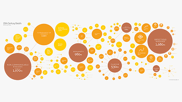
(4) morbidly delicious – the folks over at the Guardian took it upon themselves to gather + analyze mortality data from around the world in an effort to determine the leading causes of death. was it murder? misfortune? maladies? check it out for yourself here How We All Die, Visualized. the largest clusters consist of non-communicable diseases, infectious diseases, humanity + the natural world.
(5) social network congestion – here’s a sharp little interactive data visualization interface by the bitly science team that illustrated a geographic breakdown of numerous social networks (many of which we haven’t a clue about). the breakdown of traffic from social networks by country features a geographic interaction which is accompanied by a set of bar graphs which change according to selected country.
(6) social resume? what’s that? – interested in creating a social resume? well, here’s a good place to start! created by onlinecolleges.com, it provides a quick visual at to the key ingredients which include – you guessed it – a linkedin profile but much, much more! the graphic also serves up key stats in regard to site usage, some do’s + don’ts as well as other related miscellany. Why You Need a Social Resume (and How to Build One) is a rather involved study so check it out!
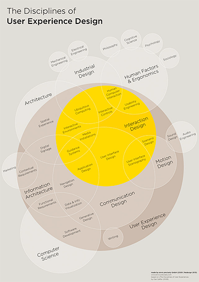 (7) the design universe (redux) – confused by all the variant forms of design that go into digital media projects? how about all of the related skillsets that are emerging or being redefined? Thomas Glaser has attempted to visualize the relationship between the various design disciplines + UX (user experience) in his Infographic: The Intricate Anatomy Of UX Design graphic. Piggybacking off of Dan Saffer’s previous iteration (called The Disciplines of User Experience Design), it serves as an updated attempt to refine the model as tech has evolved. a lofty goal indeed but well done. we commend him on his efforts + this should serve as a valuable tool for communication!
links
apps
design
dev
useful