a visual lifestyle (week of 23apr13)
This week’s findings are interspersed with some interactives in addition to the traditional static visual pieces. Please consume + enjoy.
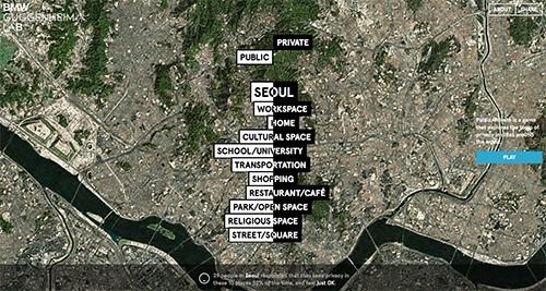 (1) seeking privacy in public – this nifty interactive positions itself as a game in order to gather information from willing participants in order to gather data on which spaces (be they public or private) individuals seek privacy. after a short 60-sec inquiry, you are asked to rate the degree to which you seek privacy in spaces such as home, work, school, the park + so forth. your data points are then compared to others in your immediate (city) area as well as another city which the app selects. despite the beauty + simplicity of the app, it seems to lack teeth or tangibility in its final delivery. summary statements such as “29 people in Seoul responded that they seek privacy in these 10 places 52% of the time, and feel just OK” don’t necessarily mean much when you break it down.
(2) time travel + movies = brain pain – created by a mysterious tumblr user opting for the handle mr. dalliard, this visual is yet another stab at the complexities of time travel as related to relics of pop culture – it’s movies this time round! things look great at first – stylistically coherent, a little retro-scientific homage thrown in to boot, clever approach; however, upon closer scrutiny, i can’t help but think that there might be a better means of illustrating these relations (nothing comes to the fore an of now but it’s a gut feeling). atop that, some of the key categorizations seem off or used rather loosely. take some time + dig in to see for yourselves.
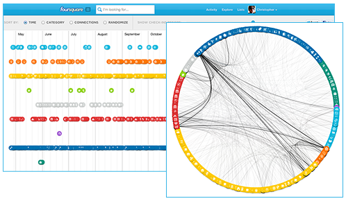 (3) my foursquare year in check-in’s – in commemoration of this years foursquare day (16 april), that great bastion of location-based social media gave its users the gift of his/her own personal infographic outlining the past year’s activity! end users can view according to category, connections, time or randomly. furthermore, one can contract the timeline to see a particular period of activity. overall, a great way to interact with one’s own personal data collection.
(4) teens dropping facebook like a bad habit? – this playful amalgam of colors, fonts + shapes vividly depicts recent reports finding that the teen market is using facebook less or completely abandoning ship + using other ephemeral, more conversationally-suited social media outlets (e.g. kik, whatsapp, snapchat) instead. blending both quantitative + qualitative data, this visual offers more complete insight into this emerging trend.
(5) edgerank…sounds like tricky maths to me – facebook’s edgerank has mystified persons near + far alike…be them in marketing, IT, the c-suite or otherwise. this handy infographic attempts to solve the quandary in a simple, linear, easy-to-read self-contained package. edgerank, the algorithm which facebook uses to determine the items in the news feed that are most relevant to you, consists of 3 primary variables: affinity, weight + time decay. or, in a more digestible format, it consists of your personal interaction + your network reaction (see the chart for details). to bring the message home, a handy batman analogy serves as the icing on the cake. to be honest, this beats reading the equivalent whitepapers pounding about the interwebs.
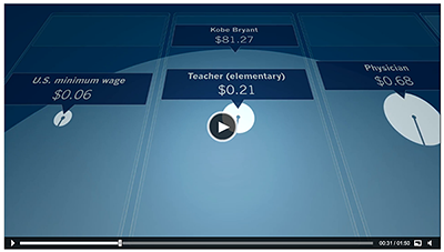 (6) dollar…dollar bills – despite being a video, ‘sixty seconds of salary’ does a great job of utilizing the timeline (sans interactivity) to express the vast discrepancies in levels of income amongst a wide array of individuals. be they the president, a prominent CEO, a basketball pro, a teacher or a minimum wager, it’s quite revealing to see this evolve in such an eloquent visual form. props all round + make sure to check it out here!
links
- http://www.fastcodesign.com/1672399/infographic-seeking-privacy-in-public
- http://www.fastcodesign.com/1672395/infographic-a-flowchart-maps-time-travel-in-the-movies#1
- https://foursquare.com/infographics/4sqday
- http://allfacebook.com/infographic-teens-right-mix_b115678
- http://blog.hubspot.com/understanding-facebook-edgerank-algorithm-infographic
- http://www.fastcoexist.com/1681832/watch-income-inequality-in-real-time-as-exxonmobils-ceo-out-earns-you-by-a-lot